Onyx Design System
My role: UI & UX Design, Creative Direction, Design Systems | Industry: Cybersecurity, SaaS
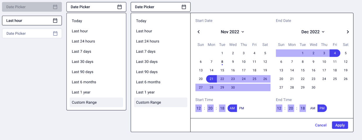
The Onyx design system is a collection of pre-built and reusable assets like components, patterns, guidance, and code that allow Securonix designers, developers, and other stakeholders to build consistent digital experiences faster.
By using the pre-built and universal assets of the Onyx design system, time spent designing and building is minimized. Instead of building and re-building basic elements, designers and others can spend that time customizing their products to address different use cases efficiently.
Process
Problem
Before implementing a design system at Securonix, our products suffered from a lack of cohesion and standardization. The absence of clear guidelines led to a staggering 1,711 colors in use, including 300 variations of blue. Designers worked without established parameters, while engineers lacked access to documented code components. This fragmented approach resulted in inefficiencies, bloated code, inconsistent user experiences, and hindered product development.

A screenshot of the 1,711 production colors used in our SaaS product. Over 300 variations of blue (products brand color at that time).
Absolute bonkers!
Before
Solution
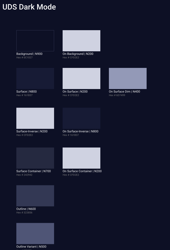
The UX team collaborated with our front-end UI development team to create two solutions, resulting in the development of a Figma Design System named Onyx. This design system, which includes a Dark Mode utilizing Figma variables, was thoroughly tested to ensure quality. The Onyx Design System is exported to Storybook, where engineers document and maintain reusable code components. This workflow delivers a unified and consistent user experience.

The Onyx Design system is based off of the MUI framework.

Figma Design Components that reads a JSON file and outputs to our Storybook. Anytime a change is made our engineers have the latest update.
From 1,777 colors to 34 colors
After
This screenshot showcases a Figma project that utilizes the Onyx Design System. The product is displayed using the light theme token and demonstrates the naming conventions applied to selection colors.
Additionally, the system leverages Figma Primitives to seamlessly switch between different product themes. For instance, some large MSSPs have white-labeled our product (not shown here due to NDA restrictions).